What Pantone’s Mocha Mousse Says About Us in 2025
Color wields the ability to manipulate our perception of everything ; time, space, temperature, even taste. It’s the silent orchestrator…

Color wields the ability to manipulate our perception of everything ; time, space, temperature, even taste. It’s the silent orchestrator behind our daily choices from putting together a simple outfit, guiding us to our preferred boxed cereal at the grocery store, to symbolizing major social movements that marks our history.
In today’s visual culture (especially online), color is part of how we construct our identities seen by :
- How entire aesthetics live and breathe through color : the clean girl’s soft neutrals, coquette’s dreamy pinks, dark academia’s inky browns and shadowy greys.
- The practice of determining one’s ‘color season’ has gained popularity (I’m guilty), enabling individuals to choose palettes that harmonize with their features and influencing what products to buy.
If there’s anyone that understands this better than anyone, it has got to be Pantone. Under the leadership of Leatrice Eiseman, the Executive Director, Pantone annually chooses a carefully curated color to be the Color of the Year. This team of panelists comprises global experts specializing in various design disciplines, including color consultation, trend forecasting, and cultural analysis. Throughout the year, they observe fashion, social trends, art, even going as far as assessing socio-economic situations and the emotional impact to society.
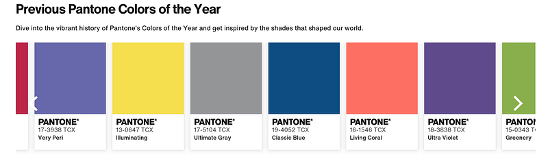
In retrospect, PANTONE 19–4052 Classic Blue was chosen in 2020 to represent confidence and calmness to bring clarity during a time of uncertainty (the pandemic). In 2022, PANTONE 17–3938 Very Peri reflected the blend of digital and physical life. This was inspired by gaming, the metaverse, and digital art. It symbolized creativity, innovation, and the merging of virtual trends into the real world. Thus, understanding the Color of the Year might give us a clue into societal trends and the emotional undercurrents influencing design and consumer preferences.
Enter PANTONE 17–1230 Mocha Mousse, Pantone’s chosen Color of the year for 2025. The color is described as a warming brown hue a sense of richness. It is mellow, dependable, and comforting.
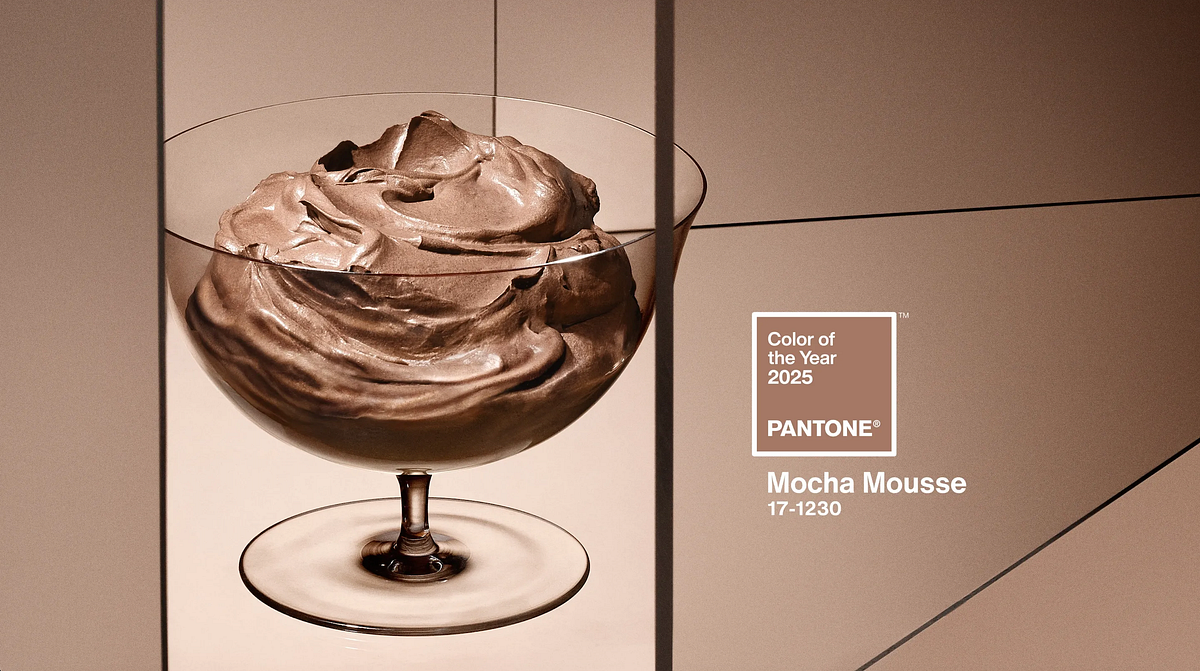
an Evocative soft brown that transports our senses into the pleasure and deliciousness it inspires. Following on from Pantone 13–1023 Peach Fuzz, our pick for Color of the Year 2024, Mocha Mousse nurtures with its suggestion of the delectable quality of cacao, chocolate, and coffee, appealing to our desire for comfort.
— Leatrice Eisman, Executive Director of Pantone
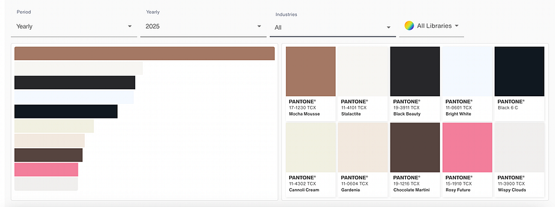
Throughout the first quarter of 2025, Mocha Mousse has been widely used across industries and is the number one most used color.
Mocha Mousse’s versatility lies in its ability to act as both a neutral foundation and a complementary accent, making it a timeless choice across multiple design disciplines. It blends seamlessly with earth tones (like olive, terracotta, sand), cool neutrals (like greys or off-whites), or even bold accent colors (think cobalt, emerald, or coral). Here’s how you can easily incorporate this color into your life :
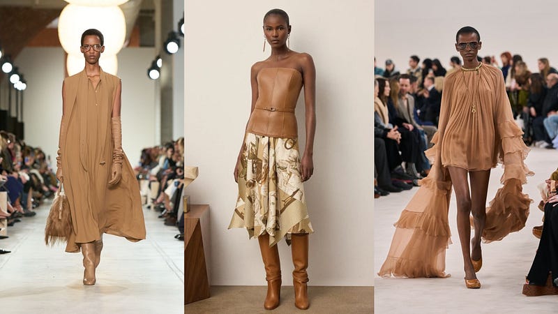
- Fashion : Mocha Mousse is anticipated to influence apparel and accessories, offering a versatile neutral that complements a range of colors and styles. It also lacks the stereotypical “signals” often tied to gendered colors, making it gender neutral. Seeing how gender neutral clothing has been on the rise over the past few years, mocha mousse fits right into the agenda.
- Interior Design : This hue can create warm, inviting spaces. It is ideal for use in living rooms, kitchens, and bedrooms, either as a primary color or an accent. Mocha Mousse pairs well with natural materials like wood and stone, enhancing its connection to nature.

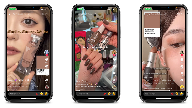
- Beauty : From your nails to your hair, Mocha Mousse offers a flattering shade for various skin tones. As an extension from the previous rich espresso color, we are moving on to a more subtle and muted shade of brown.
So here we are: moving from the softness of Peach Fuzz (2024) — a color about healing, empathy, and gentle connection, into the richness of Mocha Mousse, which feels like a color about comfort.
Here’s the big question : If it is a pulse-check for what people want, what does it promote?
Here’s my take.
1. Where Calm Meets Color
The selection of Mocha Mousse signifies a shift towards embracing earthy, grounding colors that foster a sense of stability and connection with nature. This choice reflects broader societal trends prioritizing comfort, well-being, and a return to natural elements in daily life.
Mocha Mousse doesn’t just sit on the walls or hang in a wardrobe, it creates atmosphere, wrapping us in a sense of sanctuary.
2. the Art of Understatement

Mocha Mousse doesn’t scream wealth, it whispers.
In the age of “quiet luxury,” status is less about logos and more about confidence in restraint. Think of the cashmere sweater that fits just right, or the perfectly worn leather chair in a minimalist home. These aren’t things meant to impress at first glance. They’re meant to age well, feel good, and stay relevant. Mocha Mousse slips seamlessly into that world, offering an elevated neutrality that whispers taste and refinement without trying too hard. This aligns with the trend of subtle sophistication, where luxury is conveyed through simplicity and quality. The color’s rich yet unpretentious nature makes it a perfect fit for this intention.
3. the Point Zero of Trends

In a time when micro-trends move at algorithm speed, Mocha Mousse is a reset button. This movement towards neutral tones can be seen as a form of resistance against the relentless cycle of fleeting trends. By embracing colors like Mocha Mousse, individuals are choosing longevity over the pressure to conform to ever-changing trend dictates. This color marks a shift from trend-chasing to intentional living. They’re for people choosing pieces that last, that work across seasons, and that speak more to personal alignment than cultural hype.
In essence, Mocha Mousse serves as a reminder that sometimes, stepping back from the whirlwind of trends and embracing simplicity can be the most stylish choice of all.
4. For (More than) Your Eyes Only
“Sensorial warmth” simply means that because all of our senses are inter-connected, if you can engage more than one of our senses, the emotional impact of the color is even greater.
— Leatrice Eisman, Executive Director of Pantone

The color’s association with delectable qualities like cacao, chocolate, and coffee enhances this multisensory experience, making it both visually and emotionally appealing. In a fast, hyper-digital world, consumers often seek grounding experiences ; products, environments, and visuals that make them feel something real.
What Does it Mean for Brands?
For brands, Mocha Mousse is an opportunity to connect more meaningfully with this mindset. It aligns perfectly with the growing appetite for understated sophistication and emotional resonance. In beauty, fashion, wellness, and interiors, this color becomes a visual shorthand for quality, care, and timelessness.
From a marketing standpoint, this color is ideal for crafting narratives around well-being, intentional living, slow luxury, and thoughtful design. Whether in packaging, branded content, pop-ups, or digital experiences, Mocha Mousse invites consumers in, rather than pushing product out.
Mocha Mousse is the soft but powerful backdrop for a new kind of branding. One that whispers rather than shouts, invites rather than persuades, and prioritizes substance over spectacle.
I know I am super late on the train, given that Pantone announced the chosen color of the year right before we stepped into 2025. However, I can’t help to wonder about the room for creativity and interpretation that this color brings.
So, what do you think Mocha Mousse says about where we are right now — culturally, emotionally, spiritually? And more importantly, what does it say about what we need?
Let me know your thoughts! 😄
This site is powered by Kambium, the product of Kugie App.